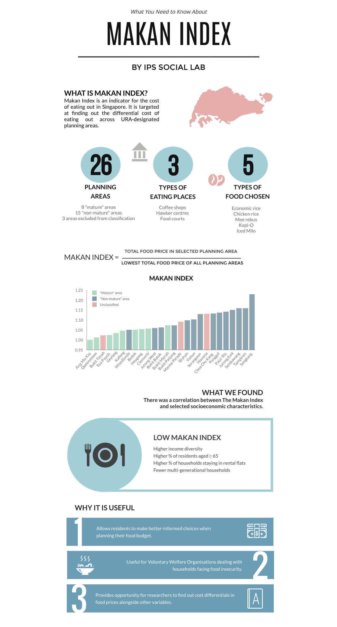

Find out from the interactive charts created by NUS Libraries below whether the cost of food in your area is higher or lower, as compared to other areas.
Cost of Eating Out
The Makan Index of 26 planning areas is illustrated on the below. The higher the Makan Index score, the more expensive it is to eat out in that planning area. Move the slider at the top of the map to filter for regions in the corresponding Makan Index values you have chosen. Hover your cursor over the map area to see the Makan Index value and the average food prices.
Stretching Your Dollar
Food prices vary widely across planning areas as shown in the scatter plot chart below. Explore the average price of chicken rice that makes up the Makan Index. Move the slider to filter for regions with average price of your selected range.